

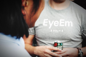
Are you planning to create a logo for your t-shirt? Are you confused about how to choose the perfect logo? Well, then you are absolutely at the right page! A well-designed logo is key to making your custom T-shirt stand out. It grabs attention and leaves a lasting impression. A good logo adds a professional touch, making your T-shirt look stylish and unique. It also helps in branding, especially for businesses. The right colors, fonts, and design make a logo more effective. A simple yet eye-catching logo works best for printing. It should be clear, even on fabric. A poorly designed logo can ruin the look of your T-shirt. Take time to choose or create a logo that truly represents your brand. A great logo makes all the difference!
Understanding Your Brand Identity – Matching Your Logo with Your Business or Personal Style

Your logo is more than just a design—it represents your brand’s identity. It tells people who you are and what you stand for. A well-designed logo creates a strong first impression and builds trust. Whether for business or personal use, your logo should match your style.
For businesses, a professional logo is key. It should reflect your industry and target audience. A tech company may use sleek, modern designs, while a bakery might prefer warm, inviting colors. Your logo should connect with your customers and make your brand memorable.
For personal use, your logo should express your unique style. Choose colors, fonts, and symbols that reflect your personality. A minimalist logo works well for a simple and classy look, while bold graphics suit creative individuals. Your logo should feel like “you” when printed on a T-shirt.
When it comes to T-shirt logo printing, simplicity is key. A cluttered logo can look messy on fabric. Stick to clean lines and clear fonts. Make sure your design is easy to read and recognize from a distance.
A well-matched logo makes your custom T-shirt stand out. It ensures your message is clear and visually appealing. Take time to create a logo that truly represents your brand or personal style!
Design Considerations – Colors, Fonts, and Layouts That Work Best for Printed T-Shirts
Choosing the right colors, fonts, and layout is key to a great T-shirt design. A well-planned design makes your T-shirt look professional and eye-catching. Simple choices can make a big impact.
Colors matter: Bright colors grab attention, while neutral shades create a classic look. Use high-contrast color combinations for better visibility. Always check how colors appear on fabric before printing.
Fonts should be clear: Bold and simple fonts work best for printing. Avoid overly decorative fonts that are hard to read. Make sure your text is visible from a distance.
Layout is important: Keep your design balanced. Centered logos look professional, while off-center prints create a trendy look. Avoid clutter—less is more.
Test your design before final printing. A great layout, clear fonts, and the right colors ensure your T-shirt looks stylish and professional. Keep it simple and impactful!
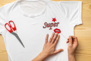
Printing Techniques & Logo Suitability – Screen Printing vs. DTG vs. Heat Transfer
Choosing the right printing technique is important for a high-quality logo print. Different methods work best for different designs and fabrics. Let’s explore the top three printing techniques.
Screen Printing is great for bulk orders. It uses stencils to apply ink, making prints durable and vibrant. This method works best for simple designs with fewer colors. However, it is costly for small orders.
Direct-to-Garment (DTG) printing is perfect for detailed designs. It works like a printer, applying ink directly to fabric. This technique is ideal for colorful, complex logos. However, DTG prints may fade over time.
Heat Transfer is best for small orders and custom prints. A design is printed on transfer paper and then pressed onto fabric. It works well for multi-color designs but may crack or peel with washing.
Each method has pros and cons. Screen printing lasts longer, DTG offers detail, and heat transfer is budget-friendly. Choose the best technique based on your logo’s complexity, fabric type, and budget.
A well-printed logo enhances your T-shirt’s look and durability. Pick the right method to make your custom T-shirt stand out!
Common Mistakes to Avoid – What to Keep in Mind to Ensure a High-Quality Print
Printing a custom T-shirt is exciting, but small mistakes can ruin the final look. Avoiding common errors ensures your T-shirt design looks sharp and professional.
Using low-quality images is a big mistake. Blurry or pixelated designs won’t print well. Always use high-resolution files for clear, sharp prints.
Ignoring color contrast can make your design hard to see. Dark prints on dark fabric won’t stand out. Choose colors that complement each other for better visibility.
Choosing the wrong fabric affects print quality. Some fabrics absorb ink better than others. Cotton works best for most printing techniques.
Skipping a test print can lead to unexpected results. Always print a sample to check colors, alignment, and quality before finalizing the order.
Overcrowding the design makes it look messy. Keep it simple and well-spaced. A clean layout makes your logo or artwork pop.
Paying attention to these details helps you get a high-quality T-shirt print. Avoid these mistakes, and your custom T-shirt will look amazing and last longer!
Conclusion
Choosing the perfect logo for your custom T-shirt is all about simplicity, clarity, and style. A well-designed logo should reflect your brand or personality while being easy to read and recognize. Use high-quality images, bold fonts, and the right colors to create an eye-catching design. Avoid clutter and make sure your logo looks great on fabric. Always test your design before final printing to ensure the best results. The right logo makes your T-shirt stand out and leaves a lasting impression. Take your time, plan carefully, and create a design you’ll be proud to wear!
**’The opinions expressed in the article are solely the author’s and don’t reflect the opinions or beliefs of the portal’**