With mission to create sustainable connected future
India, 13th February 2023: FIBER NETWORK COUNCIL APAC (earlier FTTH Council Asia-Pacific) today unveiled its new rebranded look that will focus on a more futuristic approach towards the telecommunication industry of Asia-Pacific.
“Telcos continue to evolve by capitalizing on new technologies to cater to the needs of the world while keeping customers’ convenience in the forefront of their efforts. Our previous name and logo proudly served the FTTH Council Asia-Pacific for nearly 17 years. Asia-Pacific is the most diverse region in the world and in order to bring commonality it is a prerequisite that we come forward all the fiber industry player in a single platform to bring an impact. Keeping the future global prospects of the industry in mind to make it more inclusive, we have re-branded the council to FIBER NETWORK COUNCIL APAC to crystalize our message further and keep pace with the industry and forge a new growth path that will create a seamlessly connected sustainable future with fiber.” said Mr. Venkatesan Babu, President FIBER NETWORK COUNCIL APAC on the new brand look.
The council creates opportunities for knowledge sharing and networking to deliver the next generation of Fiber in support of 5G, smart cities and IoT developments through strategic alliances and collaborations. We will step up our efforts towards new industry updates and address Fiber to Home challenges and opportunities in enabling 5G and Internet of Things (IoT) for Smart Cities on a global scale.
Mrinal Dasgupta, Founder, Four Quarters also added “We are glad to be associated with Fiber Network Council APAC as they bring the next generation fiber network to the world. This project was interesting for us as we helped them create a new brand look. The idea behind the new logo was to bring alive the core thought, which is knowledge sharing and networking. The blue circle represents our blue planet and the white lines are the fiber which connect us through and through. Add to this the font in italics which conveys the forward movement of the organization.”
Furthermore, we will release our new website in less than two weeks’ time to keep pace with the changing trend and the new brand name and logo.
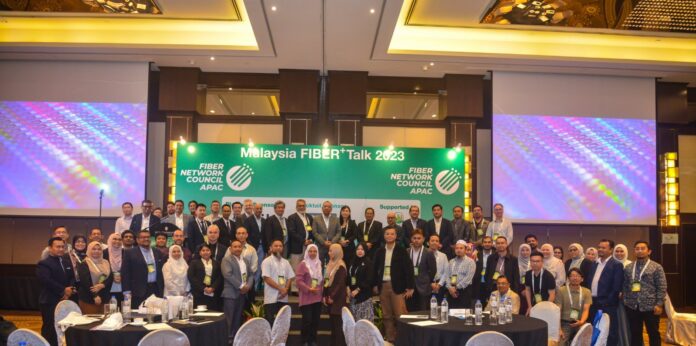
All the above announcements were part of the Malaysia FIBER+Talk 2023.

